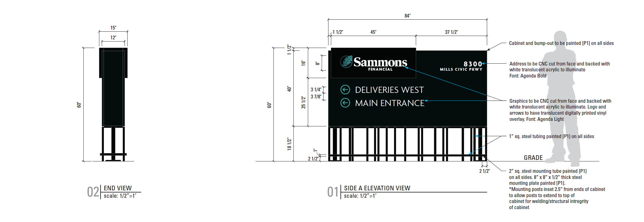
The client’s design team developed signage concepts that carried a vintage bank teller window inspired metal grid pattern throughout all of the exterior architectural signage. All signage has a linear aspect and the exterior illuminated Wayfinding signage is elevated on a fabricated steel cage base. The linear design carries through to the interior of the facility as well.
“Working as partners with our client, we were able to consult on several aspects of the signage package for efficient fabrication while complying with elegant design details. It always helps to be brought in early,” Dave Watts, Operations Manager, ImageFirst Signs.

For the signs fabricated 1” steel bars were used for the “stilts” and aluminum cabinets on top. The stilted aspects are design only. There are two 2” square steel mounting posts and steel plates that carry the weight and made installing more effective. It was imperative to the design and installation that communication was clear throughout design to ensure a slick install with such a unique design.
“The elevated signs themselves aren’t anything crazy or hard for us, it’s really just an elevated cabinet. The full package was such a nice cohesive design, we wanted to ensure everything went smoothly for our client installing.” Dave Watts.